There are two ways to produce and image:
- Capturing (e.g. a photograph)
- Creating manually (e.g. drawing and painting)
Capturing
The most obvious way of doing this, and the first easily accessible
way of doing this is using a camera. I want to have a look at
composing a photographic scene.
The American Society
of Cinematographers has this definition of cinematography
for the digital cinema:
"Cinematography is the art and
craft of the authorship of visual images for the cinema extending
from conception and pre-production through post-production to
the ultimate presentation of these images.
All and any processes which may affect
these images are the direct responsibility and interest of the
cinematographer. Cinematography is not a subcategory of photography.
Rather, photography is but one craft which the cinematographer
uses in addition to other physical, organizational, managerial,
interpretive, and image manipulating techniques to effect one
coherent process.
Cinematography is a creative and interpretive
process which culminates in the authorship of an original work
rather than the simple recording of a physical event. The images
which the cinematographer brings to the screen come from the artistic
vision, imagination, and skill of the cinematographer working
within a collaborative relationship with fellow artists."
Personally, I feel that cinematography could be better summarised
as the following: "Cinematography is the use of images to
portray a purpose". In order to bring over a purpose you
need to involve the viewer with your film of photos, one of the
most obvious ways of doing this is through good choice of camera
placing.
I have taken a few photos of random object in a friend's room.
Uninteresting subject matter aside I would like to analyse briefly
what makes a photo more interesting, or involving.
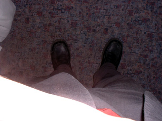
 Left
is a particularly uninteresting picture. What makes this picture
so dull? Firstly there is the bright white streak at the bottom
left, this makes it look tacky and less profound; then there is
the colour range - this photo is almost all greys, except that
if it were all greys it would probably look cleaner.
Left
is a particularly uninteresting picture. What makes this picture
so dull? Firstly there is the bright white streak at the bottom
left, this makes it look tacky and less profound; then there is
the colour range - this photo is almost all greys, except that
if it were all greys it would probably look cleaner.
To the right is a greyscale version of the left photo. By removing
the colour I have taken the focus of the photo away from the subject
matter and placed it more firmly on the depth of the photo. This
is because the lack of colour distances the viewer from the reality
of the photo and hence it allows them to see it from a more abstract
and less subjective viewpoint.
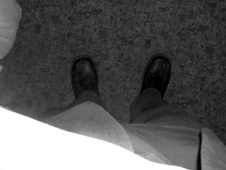
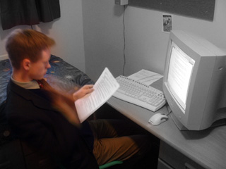 Left
is a much more interesting photo. This photo was taken carefully
so as to show the main elements fully. In my opinion the important
parts of this photo are: The person, what he is reading, and what
he is facing (the computer screen).
Left
is a much more interesting photo. This photo was taken carefully
so as to show the main elements fully. In my opinion the important
parts of this photo are: The person, what he is reading, and what
he is facing (the computer screen).
To the right I have desaturated the photo, except for Mike himself.
This is an emotive method that is used in advertising a lot (I
think it has been used in a car ad recently). The thinking behind
it is simple - by removing the colour you distance the viewer
from the subject matter - they become less subjective. As for
the out of place colour, this place immediate focus on the character
in colour - in advertising this is used to bring the viewer attention
their brilliant product.
In my own photo the effect is of alienating Mike from his surroundings,
making him look out of place, and yet quite at peace. If I were
to use this method in a film I would use it to demonstrate coping
with unusual circumstances. And, depending on the purpose of my
film, I would either slowly remove the colour from Mike as he
becomes part of the system and the surroundings, orI would bring
the rest of the scene into colour. The first has tones of defeat
in it and as such could be used to create pathos for the subject
matter. The later shows the world around Mike becoming vivid and
lively again (the return of colour) and has the opposite effect;
one of triumph and subsequently joy.
In both of the above I have captured an image, and then manipulated
it to create a new and different image. Above is a clear example
of good use of editing to produce a desired effect. Below are
a couple of pair-photos of the same scene, taken in different
ways.
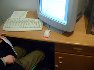
 Here
is an example of using slightly different camera angles to produce
slightly different effects.
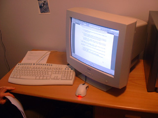
Here
is an example of using slightly different camera angles to produce
slightly different effects.
In the left picture the main focus is the mouse or the keyboard
on the desk surface, despite the screen being the most eye-catching
object in the photo it is not the subject matter because it is
only partially included.
On the right however, the entire screen is included and so the
subject matter is the screen. This is a demonstration of partial
inclusion to shift the subject matter.
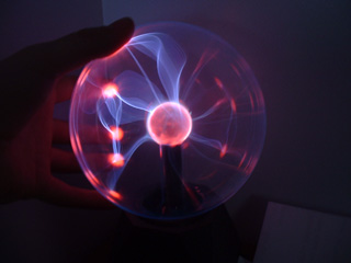
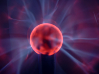 Both
of these photos are of the same subject matter, and both concentrate
on the plasma effect.
Both
of these photos are of the same subject matter, and both concentrate
on the plasma effect.
The right one is not as attractive as the left one because it
does not show the surrounding environment, and is all blurry.
This photo lacks variety and hence does not keep the viewer's
attention for very long.
The left one has a lot more recognisable object in it, and accordingly
it keeps the viewers interest for longer. I find it to be more
obvious what it is too.